Fact
A chart can mislead without a single false number
Start a bar chart's axis at 95 instead of 0 and a two-point change can look like a landslide.
The numbers can be perfectly true while the picture misleads: a cropped baseline draws each bar as its distance above the crop, not its real size — so check where the axis starts before trusting bar heights.
By the Math Says Yes editorial team
Human-reviewed under our source and correction standards.
How we review content
THE TRAP
We read bar height as quantity — but height only means quantity when the axis starts at zero.
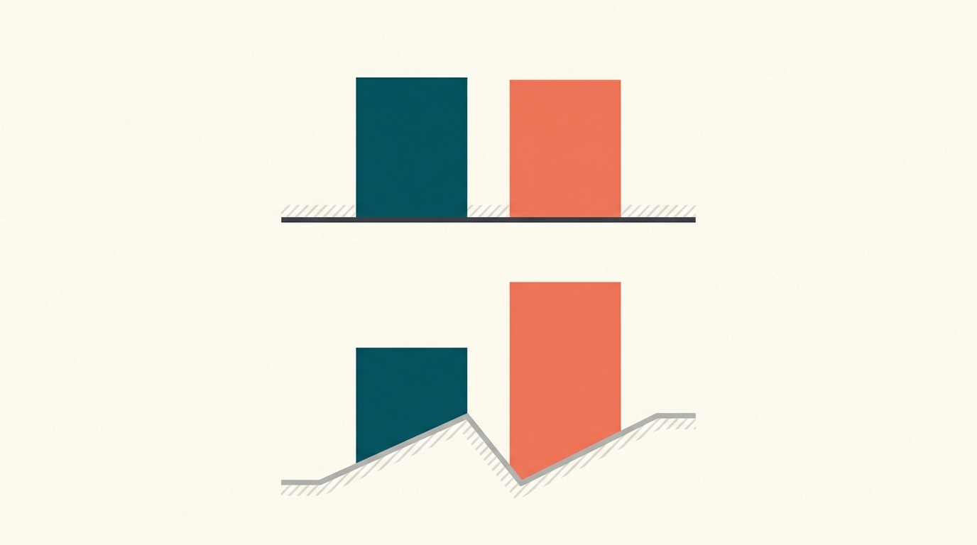
What this shows
A bar chart uses length to represent quantity. That only works cleanly when the bar starts at a meaningful baseline, usually zero. If the axis starts at 95, values of 96 and 98 are no longer drawn as 96 and 98 units tall. They are drawn as 1 and 3 units above the cropped baseline. The printed numbers can be true while the visual comparison becomes exaggerated.
What the Numbers Show
Slide 1: normal chart
0% baseline, same values
100%
50%
0%
Last year
96%
This year
98%
0% is visible, so the bars keep their real scale: 96% vs 98% are close.
Illustrative: values 96 and 98 look almost equal from 0, but 3-to-1 when the axis starts at 95.
Why intuition fails
The eye reacts before the label is read. We compare the visible length or area of the bars and infer magnitude from that shape. A cropped baseline changes the shape first and explains itself only in small axis labels later. That is why this trick is powerful: it does not need false data. It uses a truthful scale choice to produce a misleading first impression.
Worked example
Take 96% last year and 98% this year — a real change of 2 percentage points. On a zero-based bar chart, both bars are almost the same height because both are near 100%. On a chart cropped to start at 95, the bars show only the distance above 95: last year is 1 unit tall and this year is 3 units tall, so the same two-point increase now looks like the bar tripled. The numbers have not changed, but the chart has shifted attention from absolute size to cropped difference.
How to use it
Audit charts in a fixed order. First check where the axis starts and ends. Then read the actual labels, not just the bar lengths. Next calculate the absolute difference yourself. For bar charts, imagine the same values drawn from zero. If the conclusion depends on the cropped view, treat it as a presentation choice that needs justification.
What people get wrong
A chart feels like a neutral photograph of the data, but it is a stack of design choices: axis range, baseline, scale, labels, and aspect ratio all shape perception before a single number is read. That cuts both ways. Not every truncated axis is equally bad — a clearly labeled crop can legitimately reveal small changes — but the same crop can turn a two-point difference into an apparent landslide for any viewer who misses the baseline. Treat the axis as part of the argument, not part of the furniture.
When it applies
Zero baselines matter most for bar charts because bar length is read as amount. Line charts can sometimes use a narrower range to show variation, especially when the absolute level is not the story, but the axis should be obvious and labeled. If the chart is meant for persuasion rather than diagnosis, be especially skeptical of cropped baselines.
Source note
Correll's paper studies the exact design question this page raises, truncated y-axes, and supports its balanced framing: truncation can sometimes help show detail, but it can also threaten interpretation when the visual encoding implies a larger absolute difference than the data justify.
Try It
Cropped axis illusion
Compare the same chart before and after the axis baseline moves.
axis starts at 0
data stays 100 vs 103
103
51.5
0
100
103
axis starts at 0
1.03x
apparent difference
1.03x
true ratio
Both bars show the same data (100 vs 103). With a zero baseline, the visual ratio stays close to the true 3% gap.
FAQ
Why should bar charts usually start at zero?
Because a bar encodes value through its length. If the bar does not start at zero, the visible length no longer represents the full value. Small differences can look much larger than they are.
Is a truncated axis always wrong?
No. A truncated axis can be acceptable when it is clearly labeled and the chart type does not rely on area or length as a direct magnitude cue. It is risky for bars because bar length is the message.
What is the quick chart check?
Check the axis minimum, axis maximum, labels, and absolute difference. Then ask whether the same claim would still look convincing if the chart were redrawn from zero.
Quick Check
Why should a bar chart's y-axis usually start at zero?
A
It makes no real difference
B
Because axes must always include zero by convention.
C
To leave room for labels under the bars.
D
So a bar's length stays proportional to its value
Sources
Misleading graph
Secondary explainer
Wikipedia · Accessed 2026-06-14
Truncating the Y-Axis: Threat or Menace?
Primary source
arXiv · Accessed 2026-06-20
Know someone who'd like this?
Read next
Goodhart's law: when a number becomes a target, it starts to lie
A metric can be useful until people are rewarded for moving it. Then the number may improve while the real goal gets worse.