Fact
Does ice cream cause drownings?
Imagine a seasonal chart where ice-cream sales and drownings rise together. Dessert looks suspicious, but the chart alone cannot show cause.
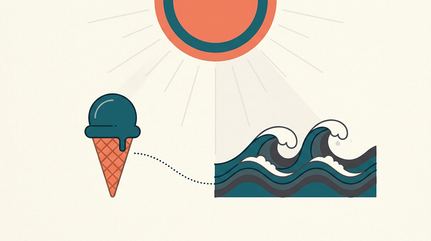
Warm weather can raise ice-cream demand and time spent in or around water. That shared seasonal influence can make two lines move together without ice cream causing drowning.
By the Math Says Yes editorial team
Human-reviewed under our source and correction standards.
How we review content
THE TRAP
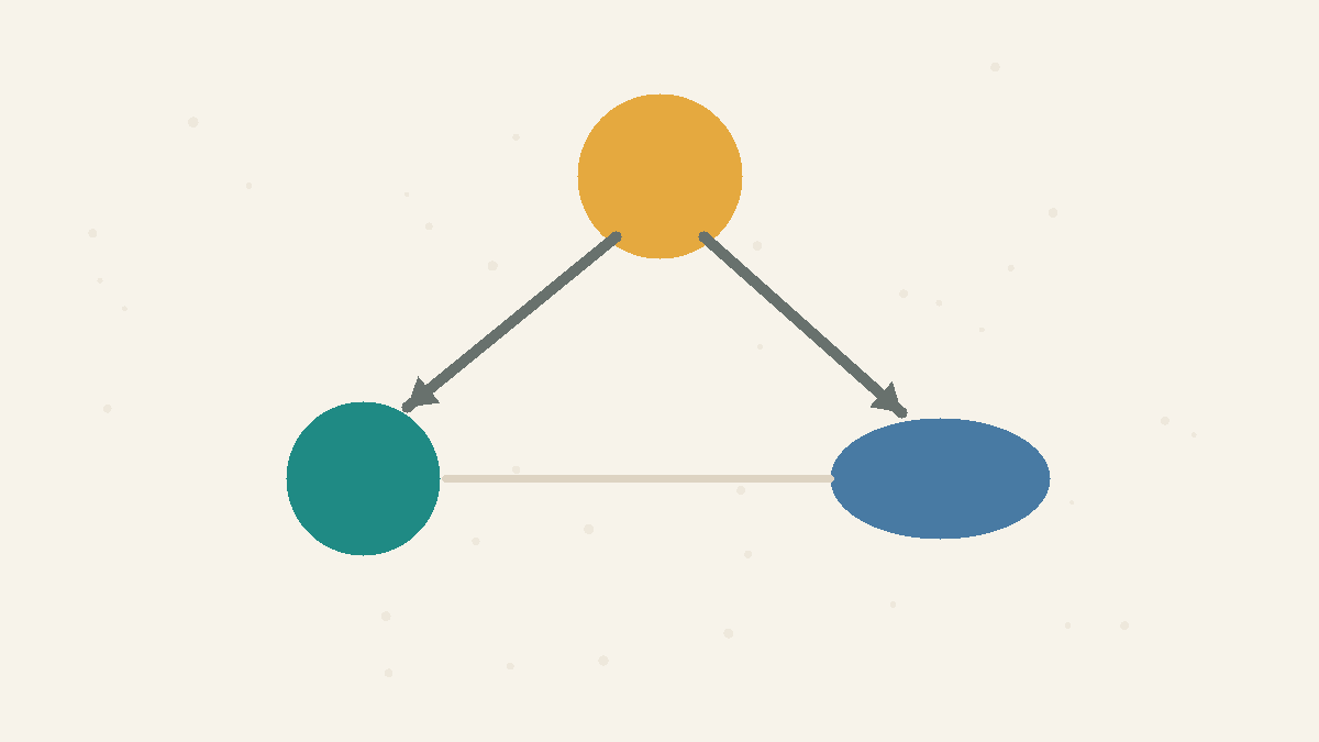
When two things rise together we assume one causes the other, but a shared cause can link them with no direct connection.
What this shows
This page uses a stylized teaching chart, not measurements from a named place. It shows how ice-cream sales and drownings could move together without ice cream causing a single drowning. Season and weather can influence both cold-dessert demand and time spent in or around water. That shared influence is a : it can create a relationship between two measurements that looks like a direct causal link.
What the Numbers Show
J
F
M
A
M
J
J
A
S
O
N
D
ice cream sales
drownings
over the year →
Stylized monthly pattern, not measured values. Both lines are drawn to follow a shared seasonal influence: warmer weather can increase ice-cream demand and water exposure.
Why intuition fails
A synchronized chart is visually persuasive because it gives the mind an easy story: one line pulls the other. But data does not label the arrow direction for you. The same can come from A causing B, B causing A, a shared cause C, or a coincidence. Seasonal data is especially vulnerable because many behaviors change together across the calendar. A causal claim needs a comparison that separates the proposed cause from those shared movements.
Worked example
Imagine grouping a year by month. Warmer periods may bring more ice-cream buying and more time spent swimming, boating, or relaxing near water. More water exposure creates more opportunities for a drowning incident; it does not make every swim dangerous or make weather the only risk factor. If both illustrative lines rise in summer, the wrong story is that ice cream leads to drownings. The better hypothesis is that season and weather changed both behaviors.
How to use it
Before naming a cause, ask four questions. What else could move both variables? Does the proposed cause happen before the effect? Is there a believable mechanism? Does the relationship remain inside comparable groups, such as days with similar temperature or months in the same season? Those checks do not prove causation by themselves, but they stop the fastest wrong story.
What people get wrong
Once you learn that is not causation, the tempting next step is to dismiss every correlation as useless coincidence — and that is its own mistake. A non-causal correlation can still be informative: it may reveal seasonality, a shared driver, a measurement artifact, or a group difference worth studying. The pattern is not the problem; the problem is jumping from the pattern to the wrong explanation. The stronger the causal claim, the more you need design evidence, not just a matching line chart.
When it applies
This warning applies to news charts, dashboards, social trends, business metrics, and health claims where two variables move together. It does not correlations are useless. Correlations can generate hypotheses, improve prediction, and reveal relationships worth testing. They become dangerous when treated as causal proof without a plausible mechanism and a design that rules out alternatives.
Source note
The monthly values on this page are a teaching model, not a dataset taken from Tyler Vigen or a live safety estimate; the ice-cream-and-drowning pairing is presented illustratively. Vigen's editorial catalogue illustrates the broader spurious- trap. Hernan and Robins provide the causal-inference grounding: causal claims need explicit assumptions and a suitable comparison, not association alone.
Try It
Hidden confounder
Slide the temperature and watch both rise together.
Hidden common cause
20°C
temperature
360
ice cream sales
5
drownings
Ice cream ≠ cause of drownings
Temperature
20°C
The fork is the causal claim: temperature pushes both outcomes upward independently.
At 20°C, ice cream sales sit at 360 and drownings at 5 — both pushed up by the heat, not by each other. Slide toward cooler days and the two fall together; the ice cream never touched the water.
FAQ
Does correlation ever prove causation?
Correlation alone is not enough. It can be part of causal evidence, but you also need timing, a plausible mechanism, and a comparison that addresses likely confounders. In this stylized example, season and weather offer a plausible shared-cause explanation; the matching chart itself does not establish which causal story is true.
What is a confounder?
A confounder is a third factor that influences both the suspected cause and the outcome. In this teaching example, season and weather can influence ice-cream buying and water exposure, creating a correlation between ice-cream sales and drownings without a direct link between them.
How do I test the causal story?
Look for comparisons where likely confounders are addressed. For this example, compare similar temperatures or similar seasons rather than hot months against cold months. If the apparent link weakens or vanishes, that weakens the direct-cause story. If it remains, that is evidence to investigate, not causal proof by itself.
Quick Check
Ice cream sales and drownings rise together. The most likely reason is:
A
Drownings cause ice cream sales
B
Ice cream causes drownings
C
Pure coincidence with no explanation
D
A shared cause: summer heat
Sources
Causal Inference: What If
Authoritative source
Harvard T.H. Chan School of Public Health · Accessed 2026-06-20
Spurious Correlations
Editorial example
Tyler Vigen · Accessed 2026-06-14
Know someone who'd like this?
Read next

Correlation vs causation: why moving together is not proof
Correlation says two things move together. Causation says one changes the other. A hidden third factor can make correlation look causal.