Lesson
Summaries Need Pictures
Means, variances, correlations, and regression lines can match while the underlying data tell completely different stories.
By the Math Says Yes editorial team
Human-reviewed under our source and correction standards.
How we review content
Compression loses shape
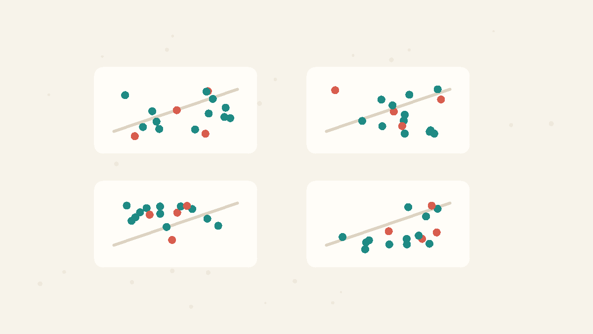
A summary statistic is a trade: it makes a dataset easier to compare by compressing many observations into a few numbers. The trade is useful, but it is not free. The same can come from a smooth bell, a two-cluster split, a flat line plus one , or a curved pattern. Once the shape is compressed away, the summary cannot tell you which world produced it.
Same numbers, different stories
Anscombe's quartet is the classic warning. Four small datasets have nearly the same , , , and line. On paper they look almost interchangeable. Draw them and the illusion collapses: one is roughly linear, one is curved, one is dominated by an , and one is mostly vertical with a single influential point. The lesson is not that summaries are useless. It is that they need visual backup.
Same summary, four pictures
The table says the summaries match. The pictures show the patterns are not interchangeable.
same
average
same
spread
r = 0.82
straight-line score
same
trend line
same avg
same spread
same line
Dataset A
steady line
A straight-line summary fits the picture.
Dataset B
hidden curve
The line misses the bend.
Dataset C
one outlier
One point pulls the summary around.
Dataset D
one leverage point
One far-away point creates the line.
What a plot reveals
A graph shows the geography of the data. You can see whether points form a line, bend into a curve, split into groups, pile against a limit, or depend on one suspicious observation. Those features change the question you should ask. A may be real but nonlinear, a may be technically correct but useless, and an may describe no one. The picture tells you which summary is safe to use.
How to use it
Before accepting a summary table, ask for the plot that goes with it. For two variables, start with a . For one variable, look at a or dot plot. Then use the summary as a label for a shape you have already inspected, not as a replacement for inspection. Good analysis moves back and forth: picture first, summary second, model third.
FAQ
Are summary statistics bad?
No. They are essential shortcuts, but they are incomplete. A mean, variance, or correlation should be read with a graph so you know what shape the shortcut is describing.
What is the practical lesson of Anscombe's quartet?
Plot the data before trusting the model. The quartet shows that identical-looking summaries can come from very different patterns, so visual checks are not decoration; they are a core quality check.
Core Concepts
Averages Mislead
The mean adds everything up and divides, so a few extreme values can drag it far from the typical case. In skewed data the median — the middle value — better represents what is normal. Ask about the shape of the data, not just its average.
Summary Statistics
Summary statistics compress a dataset into numbers such as the mean, variance, correlation, or regression line. They are useful, but they can hide shape, outliers, clusters, and curved relationships that a graph would reveal immediately.
Try the idea
Same stats, different shapes
Switch from summaries to plots and watch the four stories split apart.
9.0
mean x
7.5
mean y
0.82
straight-line score
y=3+0.5x
trend line
The straight-line score is called r. All four panels show r = 0.82, so the numbers suggest the same story.
I
r = 0.82
I
r=0.82
I: steady trend
II
r = 0.82
II
r=0.82
II: hidden curve
III
r = 0.82
III
r=0.82
III: one outlier pulls it
IV
r = 0.82
IV
r=0.82
IV: one far-away point creates it
From the numbers alone, all four datasets look interchangeable: same center, same score, same trend line.
Quick Check
What is the main lesson of Anscombe's quartet?
A
Summary statistics are never useful.
B
Averages always describe the typical case well.
C
Same summaries can hide very different shapes, so plot the data.