Concept
Summary Statistics
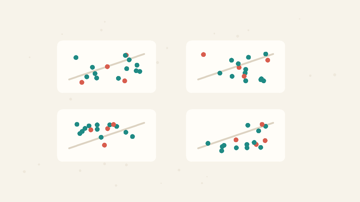
Summary statistics compress a dataset into numbers such as the mean, variance, correlation, or regression line. They are useful, but they can hide shape, outliers, clusters, and curved relationships that a graph would reveal immediately.
Related Facts
Data Tricks
5 min · easy
Standard error vs standard deviation: spread vs precision
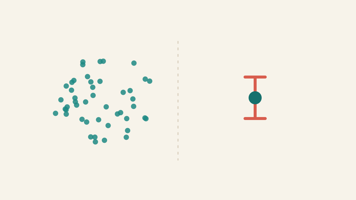
Standard deviation describes spread among individual values. Standard error describes uncertainty in an estimate such as the mean.
Data Tricks
5 min · easy
Mean vs median: which average should you use?
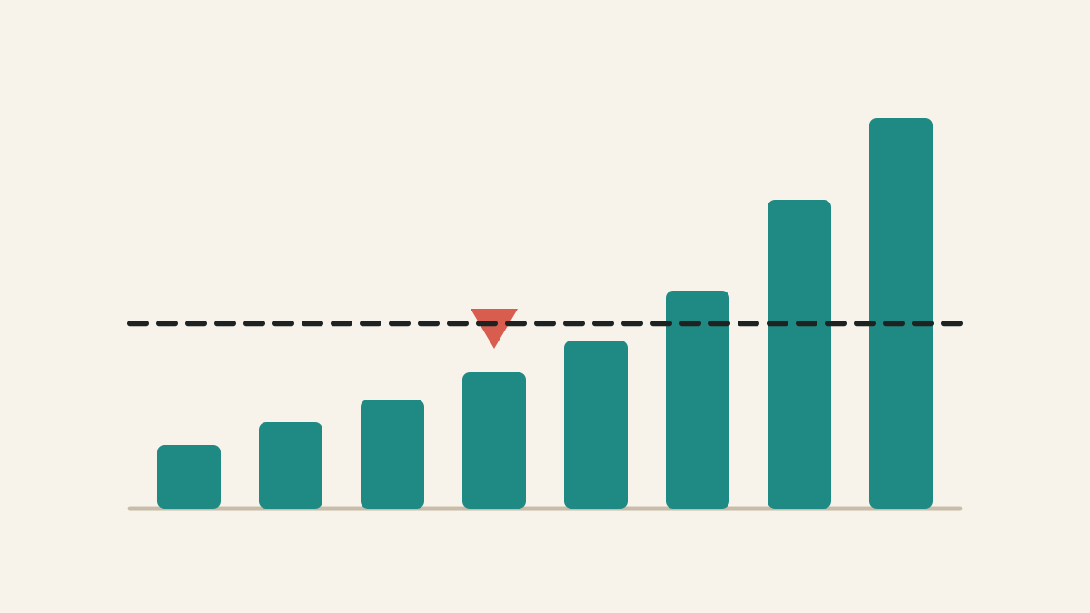
The mean shares the total equally. The median finds the middle case. In skewed data, those can tell very different stories.
Data Tricks
4 min · easy
Anscombe's quartet has the same statistics and different stories
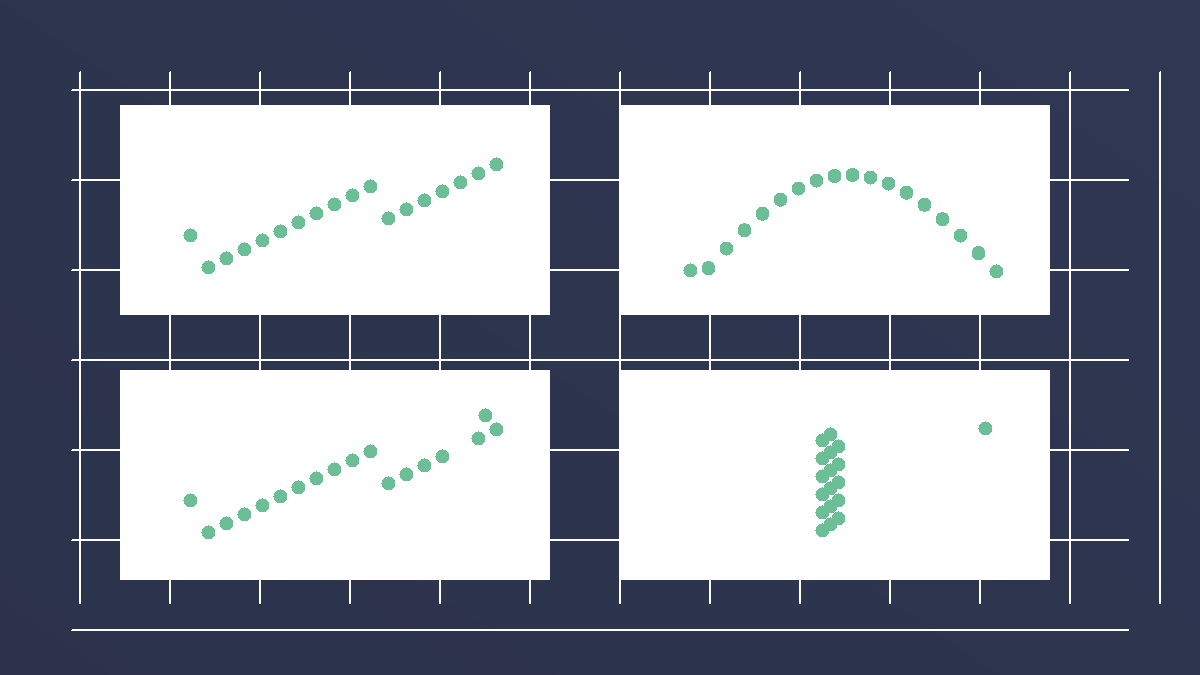
Four datasets can share almost the same mean, variance, correlation, and regression line, yet look completely different when plotted.