Fact
Anscombe's quartet has the same statistics and different stories
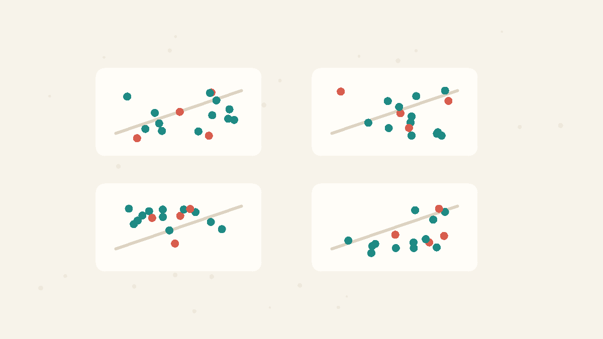
Four datasets can share almost the same mean, variance, correlation, and regression line, yet look completely different when plotted.
Anscombe's quartet is the classic proof that summary statistics need pictures. The numbers match, but the scatterplots tell four different stories.
By the Math Says Yes editorial team
Human-reviewed under our source and correction standards.
How we review content
THE TRAP
Believing that matching means, variances, correlations, and regression lines mean the underlying datasets must have the same shape.
The setup
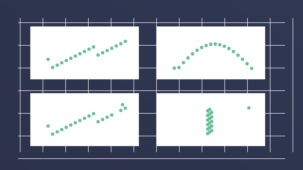
In 1973, the statistician Francis Anscombe built four small datasets to make a point about data analysis. Each dataset has the same and nearly the same basic summaries: of x, mean of y, , , and line. If you only saw the table of summaries, you would expect the datasets to behave in roughly the same way.
The reveal
Plot the points and the sameness disappears. One dataset has a fairly ordinary straight-line relationship. Another follows a curve that a straight line misses. A third is mostly linear but pulled by one unusual point. A fourth is a vertical cluster where one high-leverage point creates the apparent relationship. The same summaries have hidden four different structures.
Why summaries still matter
The lesson is not to throw away summary statistics. They are useful precisely because they compress messy data into numbers we can compare. The problem is relying on compression before checking what was compressed. A , , or answers a narrow question. It cannot show clusters, curves, boundaries, or single points with too much influence unless you also look at the data's shape. The plot is the missing diagnostic step before modeling.
How to use it
Before trusting a model or a table, ask for a plot. For two numerical variables, start with a and look for curve, clusters, outliers, and leverage points. For one variable, use a or dot plot. Once the shape is visible, the summary statistics become more useful because you know what kind of shape they are summarizing.
Worked example
Imagine four product teams all report the same satisfaction score, the same spread, the same trend line, and the same straight-line score between response time and satisfaction. A dashboard could make them look interchangeable. But the real stories could be different: one team may be steadily improving, one may have hit a speed plateau, one may be distorted by one unusual day, and one may be driven by a single large account. The same summary table would suggest one action; the underlying stories would suggest four different actions.
Dashboard sees the same stats
All four teams share the same average, spread, straight-line score, and trend line. The cards below show what those numbers hide.
7.5
avg satisfaction
same
spread
r = 0.82
straight-line score
up
trend line
avg 7.5
same spread
trend up
Team A
steady improvement
Faster replies usually mean happier users.
Team B
speed plateau
Speed helps at first, then levels off.
Team C
one unusual day
One bad day bends the summary.
Team D
one large account
One big account creates the trend.
When it applies
The lesson applies whenever a decision depends on compressed numbers: correlations, averages, slopes, rankings, or KPI summaries. It is less about one special dataset and more about analysis workflow. Summaries should come after shape checks, not instead of them. If the data are high-dimensional, the same principle still holds: inspect residuals, segment patterns, and influential cases before trusting the single score.
What people get wrong
Matching summaries are not matching evidence. Same , same , and same can still hide different shapes. A summary statistic is a compressed view, not a diagnostic. If the shape matters for the decision, the plot is not decoration; it is evidence.
Source note
Anscombe's original 1973 article created the quartet to argue for graphs in statistical analysis. The source supports both parts of this page: the datasets share key numerical summaries, and their scatterplots reveal different structures. The page uses that example as a general rule for modern dashboards and model checks.
Try It
Same stats, different shapes
Switch from summaries to plots and watch the four stories split apart.
9.0
mean x
7.5
mean y
0.82
straight-line score
y=3+0.5x
trend line
The straight-line score is called r. All four panels show r = 0.82, so the numbers suggest the same story.
I
r = 0.82
I
r=0.82
I: steady trend
II
r = 0.82
II
r=0.82
II: hidden curve
III
r = 0.82
III
r=0.82
III: one outlier pulls it
IV
r = 0.82
IV
r=0.82
IV: one far-away point creates it
From the numbers alone, all four datasets look interchangeable: same center, same score, same trend line.
FAQ
What is Anscombe's quartet?
It is a set of four datasets with nearly identical summary statistics but very different scatterplots. It is used to show why graphs are essential in data analysis.
What should you check before trusting a correlation?
Plot the data. A correlation can hide nonlinearity, separate clusters, outliers, or one influential point that drives the whole relationship.
Quick Check
What is the main lesson of Anscombe's quartet?
A
Summary statistics are never useful.
B
Averages always describe the typical case well.
C
Same summaries can hide very different shapes, so plot the data.
Sources
Anscombe's quartet
Secondary explainer
Wikipedia · Accessed 2026-06-16
Graphs in statistical analysis
Primary source
The American Statistician · Accessed 2026-06-20
Know someone who'd like this?
Read next
Standard error vs standard deviation: spread vs precision
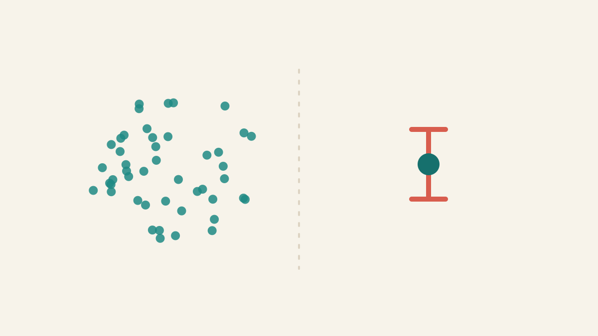
Standard deviation describes spread among individual values. Standard error describes uncertainty in an estimate such as the mean.
Concepts
Averages Mislead
The mean adds everything up and divides, so a few extreme values can drag it far from the typical case. In skewed data the median — the middle value — better represents what is normal. Ask about the shape of the data, not just its average.
Summary Statistics
Summary statistics compress a dataset into numbers such as the mean, variance, correlation, or regression line. They are useful, but they can hide shape, outliers, clusters, and curved relationships that a graph would reveal immediately.