Glossary term
Histogram
A chart that slices the number line into bins and draws a bar counting how many values land in each — making the data's shape visible.
Visual intuition
mean
Bin these values and count — the bar heights are the shape
Each dot is one raw value scattered around the mean. A histogram organizes exactly this: slice the axis into equal bins, count the dots in each, and draw the counts as bars — turning a cloud into a readable shape.
Example
Bin 200 commute times into 10-minute bins and the bars might peak at 20 to 30 minutes with a long right tail past 60 — a shape, and a , that the 31-minute alone would never reveal (illustrative numbers).
How It Works
Take every value in a dataset, slice the axis into equal bins — 0 to 10, 10 to 20, and so on — and stack a bar per bin counting how many values fell in. The result shows the data's shape at a glance: one hump or two, symmetric or long-tailed, gaps and stragglers. That shape is exactly what single-number summaries erase — a of 40 could be a tight pile at 40 or two camps at 20 and 60, and only the picture tells you which. Unlike a bar chart, the x-axis is a number line, so the bar order is not a choice. The one big knob is bin width: too wide smooths detail away, too narrow shatters the shape into noise — it is worth trying a couple.
Lessons
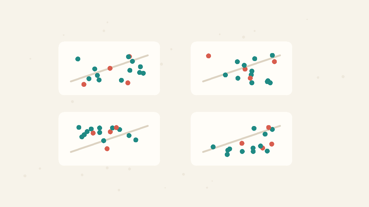
Summaries Need Pictures
Means, variances, correlations, and regression lines can match while the underlying data tell completely different stories.
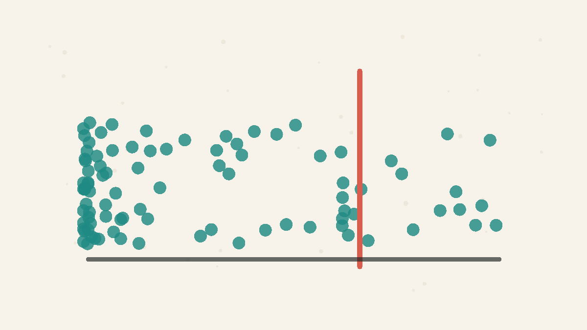
Averages Hide the Shape
A single number cannot capture a lopsided distribution.
Related Facts
Data Tricks
4 min · easy
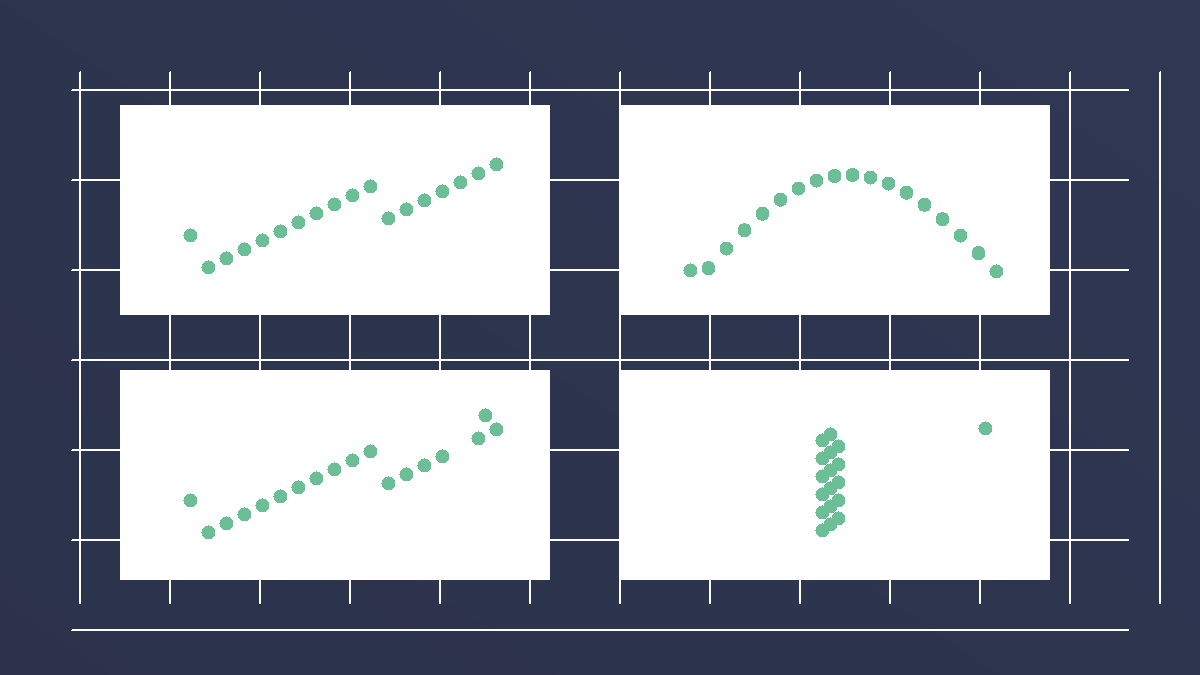
Anscombe's quartet has the same statistics and different stories
Four datasets can share almost the same mean, variance, correlation, and regression line, yet look completely different when plotted.
Data Tricks
5 min · easy
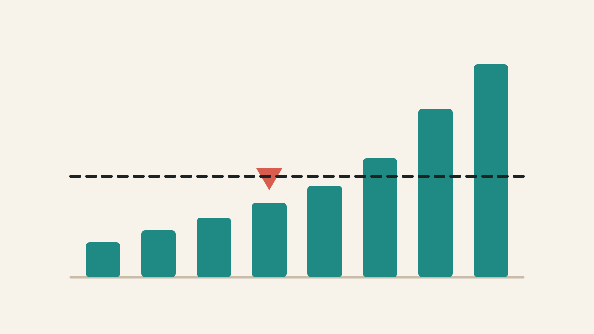
Mean vs median: which average should you use?
The mean shares the total equally. The median finds the middle case. In skewed data, those can tell very different stories.
Data Tricks
4 min · easy
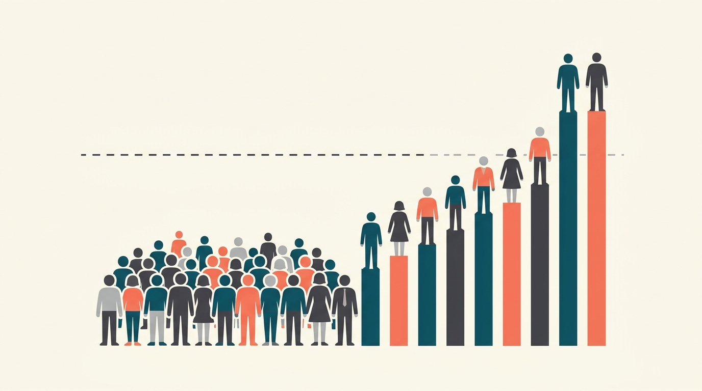
Most people earn less than the average wage
In a lopsided economy, a handful of huge incomes pull the 'average' above what a typical person actually makes.