Glossary term
Scatter Plot
A chart that draws one dot per observation, placed by its values on two axes, to reveal how two quantities relate.
Visual intuition
One dot per observation, placed by its two values
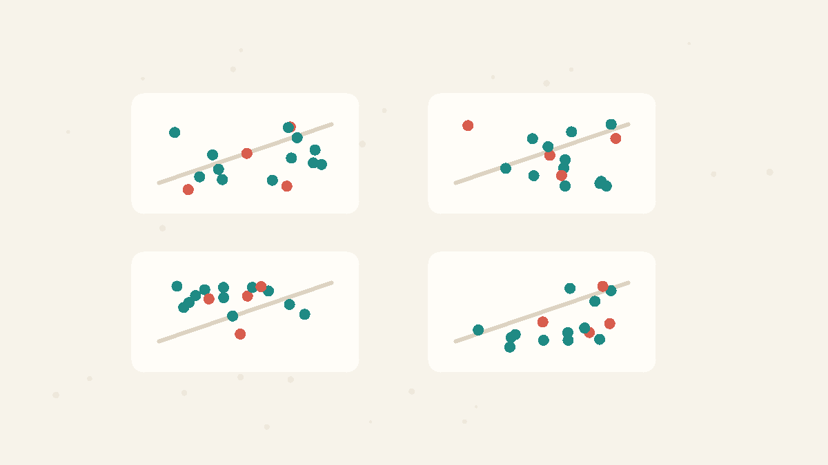
A scatter plot, literally: nine observations, each dot placed by its pair of values, with the dashed trend line summarizing the upward drift the dots reveal.
Example
Plot 30 days of temperature against ice-cream sales and hot days pile in the upper right, cool days in the lower left — an upward drift that a single of, say, +0.8 summarizes but cannot show.
How It Works
Each observation becomes one dot: this day's temperature across, that day's ice-cream sales up. Dozens of dots later, the relationship between the two quantities is visible as geometry — a rising drift, a curve, two separate clusters, one dot far from everything. That is what makes scatter plots the honest first step before any or number: Anscombe's quartet is four datasets with identical summary statistics whose scatter plots look wildly different. Reading one: look for direction (up, down, none), tightness (how closely the dots hug the trend), and anything that is not a line — curves and clusters break straight-line summaries.
Concepts
Correlation vs Causation
Two things moving together does not mean one causes the other. A third variable (a confounder) can drive both, or the link can be coincidence. Establishing causation needs more than correlation — usually a controlled comparison.
Summary Statistics
Summary statistics compress a dataset into numbers such as the mean, variance, correlation, or regression line. They are useful, but they can hide shape, outliers, clusters, and curved relationships that a graph would reveal immediately.
Related Facts
Data Tricks
4 min · easy
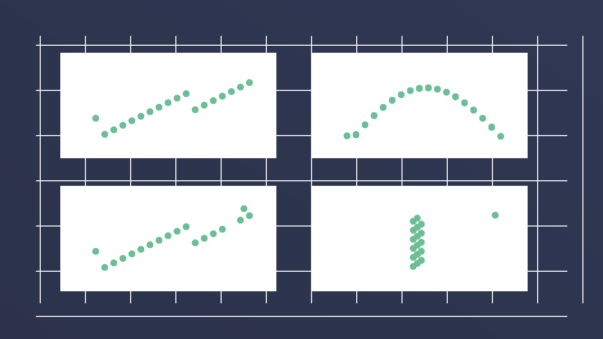
Anscombe's quartet has the same statistics and different stories
Four datasets can share almost the same mean, variance, correlation, and regression line, yet look completely different when plotted.
Data Tricks
5 min · easy

Correlation vs causation: why moving together is not proof
Correlation says two things move together. Causation says one changes the other. A hidden third factor can make correlation look causal.
Data Tricks
4 min · easy
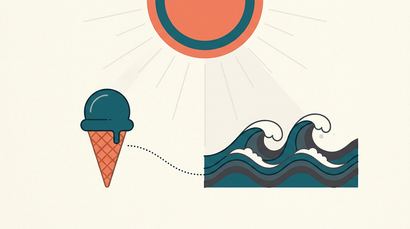
Does ice cream cause drownings?
Imagine a seasonal chart where ice-cream sales and drownings rise together. Dessert looks suspicious, but the chart alone cannot show cause.