Collection
Risk Literacy
Statistics for reading risk claims, test results, relative changes, margins of error, and rare events.
Risk claims often sound bigger or smaller than they are. A relative increase can hide a tiny absolute change. A strong test can still create many false alarms when the condition is rare. A poll lead can sit inside the margin of error.
This collection focuses on decisions under uncertainty: convert percentages into counts, compare risks on a common scale, and separate average outcomes from worst-case outcomes. None of it asks you to become fearless, or to distrust every number; the aim is to see risk at the scale where a decision is actually made.
The pages are especially useful for reading health claims, safety claims, polling headlines, legal evidence, and product metrics. They show how a number can be technically true and still badly framed for judgment.
Translate percentages into people
A 50% increase sounds large until you learn whether the baseline was 2 in 10,000 or 2 in 10. Base rates, absolute risk, and natural frequencies turn abstract percentages into counts you can reason about. This is the fastest way to make rare-event claims less misleading.
Separate average, uncertainty, and worst case
Insurance, micromorts, margins of error, and statistical power all require more than one number. The average outcome tells one story, the uncertainty range tells another, and the worst case can matter even when it is unlikely. Good risk literacy keeps those layers separate instead of collapsing them into a single feeling.
Use this hub for real decisions
When a risk headline appears, start with base rate and absolute risk. If the claim comes from a test or poll, add false positives, margin of error, and power. If the claim is tied to incentives, use Goodhart's law to ask whether the metric may have changed behavior. The facts below are short, but together they form a decision checklist.
Featured Facts
Risk & Decisions
4 min · medium

A good test can still scare too many people
When a condition is rare, most positive test results can still be false positives.
Risk & Decisions
4 min · medium

A "50% higher risk" can still be almost nothing
Headlines shout '50% more likely!' — but 50% more of a small risk is still a small risk.
Risk & Decisions
4 min · medium

Insurance is a bet you want to lose
On average you pay in more than you ever get back. Buying it is still the smart move.
Risk & Decisions
4 min · easy
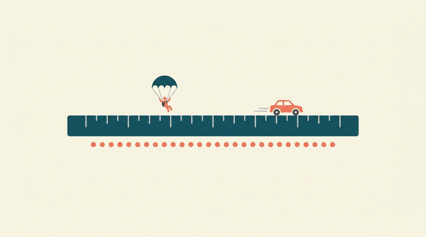
How risky is skydiving, really?
A "micromort" is a one-in-a-million chance of dying — and it lets you compare a skydive to a long drive on the same scale.
Risk & Decisions
4 min · easy
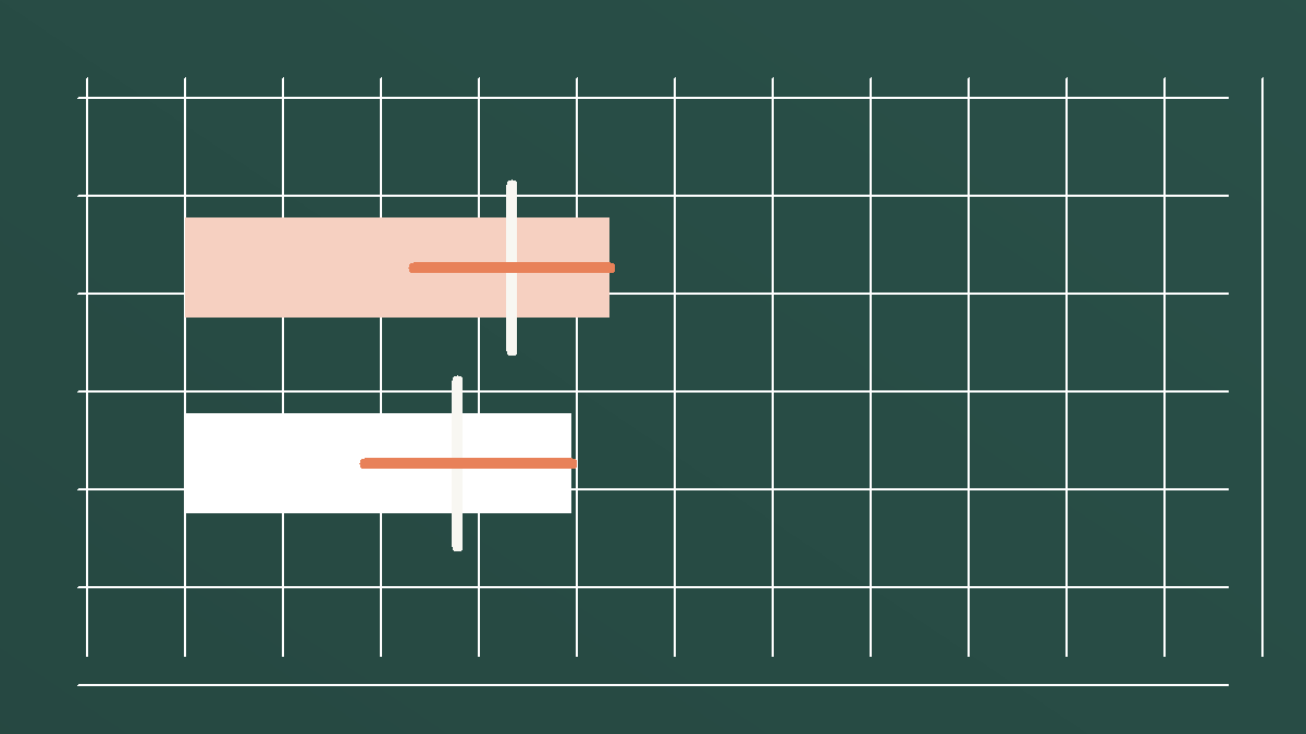
A three-point poll lead can still be a tie
If a poll says 51% versus 48% with a plus-or-minus 3 point margin of error, the headline leader may not really be ahead.
Risk & Decisions
4 min · medium
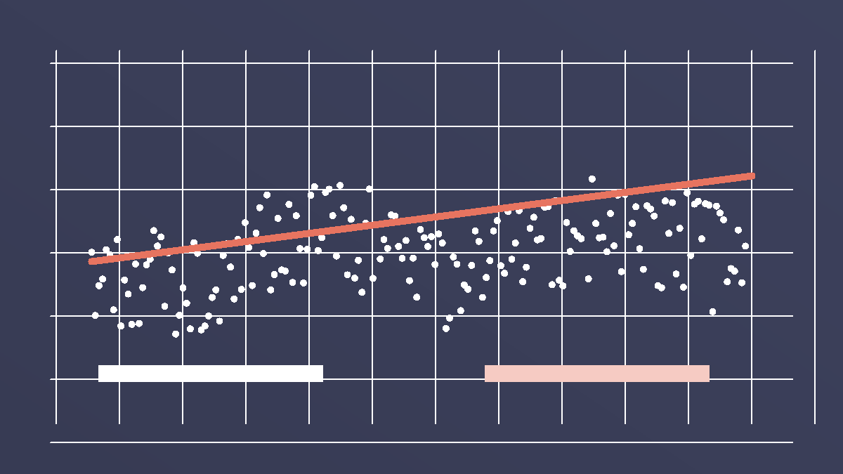
Statistical power: a small study can miss a real effect
A study can report 'no clear effect' simply because it was too small and noisy to spot a real one.
Risk & Decisions
4 min · medium

A one-in-a-million match is not a one-in-a-million chance of innocence
When a forensic trait matches 1 in a million people, a big enough population still holds many innocent matches — the match probability is not the probability of innocence.
Risk & Decisions
4 min · easy
Goodhart's law: when a number becomes a target, it starts to lie
A metric can be useful until people are rewarded for moving it. Then the number may improve while the real goal gets worse.
Risk & Decisions
5 min · medium
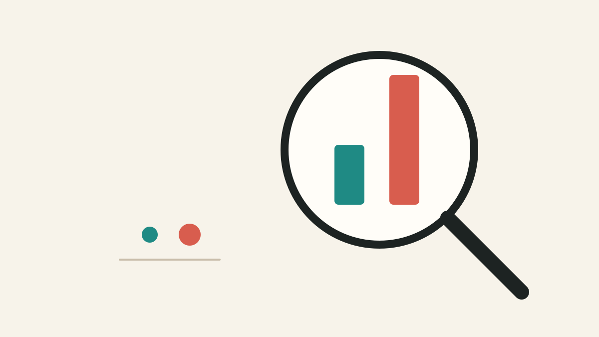
Relative risk vs absolute risk: the difference that changes decisions
Relative risk tells you how many times bigger a risk became. Absolute risk tells you how many extra people are affected.
Lessons
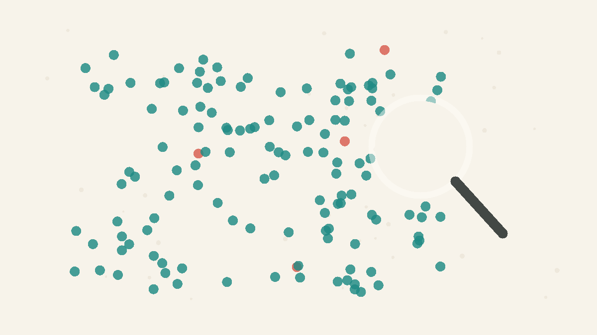
Rare Things Stay Rare
Even strong evidence can mislead when the thing you are testing for is very uncommon.
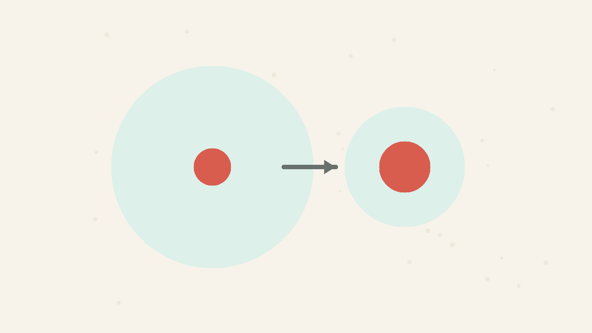
Ask for the Absolute Number
A percentage change is meaningless without the base it changes.
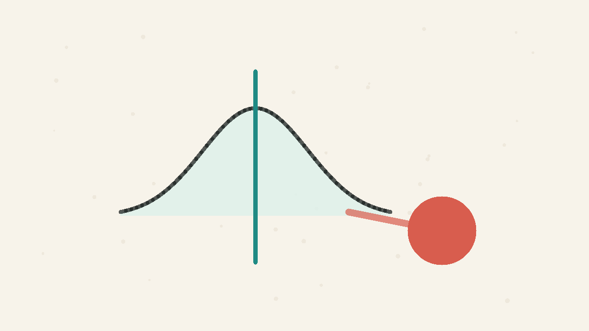
The Average Isn't the Whole Story
Expected value ignores how badly the rare outcome would hurt.
Put Risks on One Scale
Compare dangers by a common unit, not by how vivid they are.
Uncertainty Needs Ranges
A measured number is usually a best estimate with sampling wobble around it, so honest comparisons need ranges as well as point estimates.
Concepts
Base Rates
The background frequency of something before you consider new evidence. A strong signal can still produce many false alarms when the thing being tested for is rare, because there are many more non-cases than cases. Good reasoning combines the new signal with the base rate.
Absolute vs Relative Risk
A relative change ('50% more', 'doubles your risk') hides how big the underlying risk actually is. A large relative increase on a tiny base rate is still tiny. Always ask for the absolute numbers — how many in 100 before and after — not just the percentage change.
Expected Value
The long-run average outcome: each result weighted by how likely it is. It tells you whether a bet is favourable on average, but it ignores how badly a single rare outcome would hurt — which is why people rationally pay to avoid losses they could not absorb.
Comparing Risks
Putting different dangers on one common scale — like the micromort, a one-in-a-million chance of death — lets you compare activities honestly, instead of ranking them by how frightening they feel.
Margin of Error
A margin of error is the plus-or-minus range around a survey estimate caused by sampling uncertainty. If two estimates have overlapping uncertainty ranges, the apparent leader may not be truly ahead.