Collection
Interactive Statistics Examples
Hands-on simulations that make probability, risk, sampling, and data tricks easier to see.
Some statistical ideas only click when you can move the numbers yourself. This collection gathers the Math Says Yes examples with interactive demos: switch doors in Monty Hall, guess how many people it takes to share a birthday, change a base rate, crop a chart axis, simulate insurance risk, or watch small samples swing wildly.
Use these pages when a definition is not enough. Each example starts with a surprising claim, then lets you adjust the setup and see why the result changes. The goal is not to make statistics feel like a trick. It is to show which assumption changes the answer.
Start with one demo, change one input, and say what you expect before the screen updates. That small pause is where the learning happens: your first instinct becomes something you can test.
Best starting points
Start with Monty Hall if you want to see how new information changes a probability problem, or the birthday-paradox room if you want to test your gut feeling against the real odds. Use the base-rate demo if you want to understand false alarms. Try the truncated-axis example when the question is about visual persuasion, and small-samples-swing-wild when the question is why early data is noisy.
What to watch while you interact
Do not only look at the final answer. Watch which denominator changes, which cases disappear, and which outcome is being averaged. A good interactive statistics example makes the hidden structure visible: sample space, base rate, selection rule, axis baseline, or repeated random variation.
How this hub connects the site
The facts give you the surprising result, the lessons name the reusable rule, and the concepts define the vocabulary. Move between all three. If a demo feels surprising, open the related lesson next; if a word like base rate or expected value is unclear, open the concept card before continuing.
Featured Facts
Probability
4 min · easy
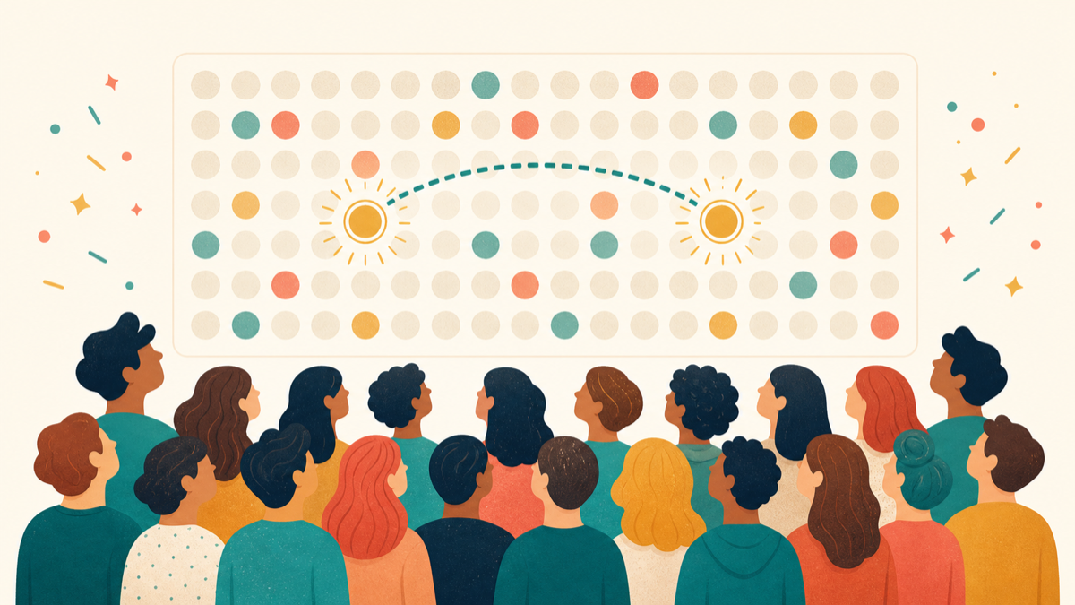
23 people are enough for a birthday match
A room with only 23 people is already more likely than not to contain two people with the same birthday.
Paradoxes
4 min · easy

The door you did not pick is probably better
In Monty Hall, switching doors wins about twice as often as staying.
Risk & Decisions
4 min · medium
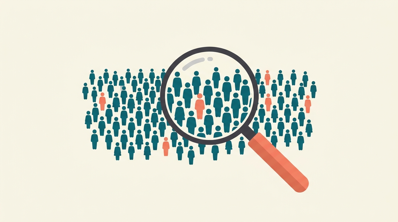
A good test can still scare too many people
When a condition is rare, most positive test results can still be false positives.
Paradoxes
4 min · medium
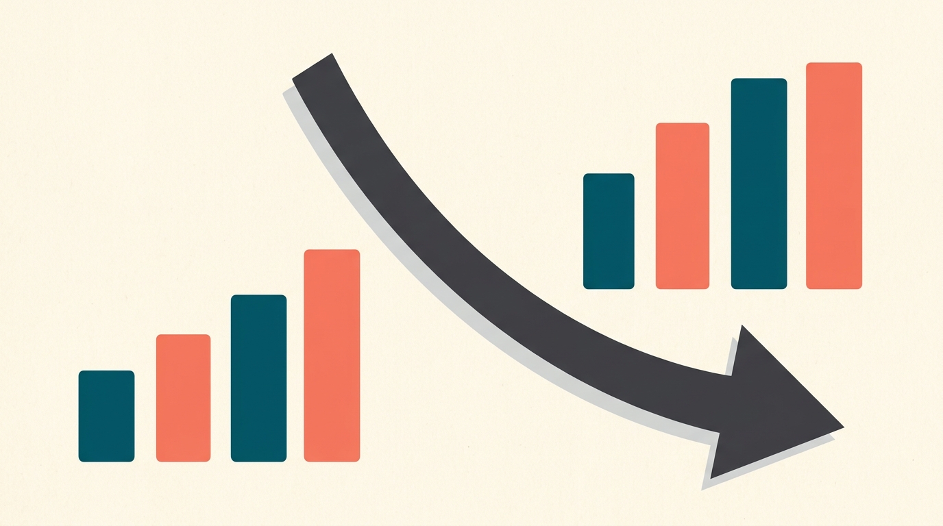
A trend can reverse when groups are combined
A treatment can look better in every subgroup but worse overall.
Data Tricks
4 min · easy
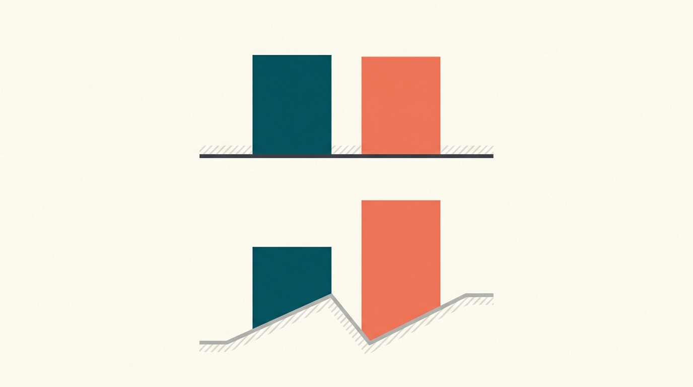
A chart can mislead without a single false number
Start a bar chart's axis at 95 instead of 0 and a two-point change can look like a landslide.
Risk & Decisions
4 min · medium

Insurance is a bet you want to lose
On average you pay in more than you ever get back. Buying it is still the smart move.
Data Tricks
4 min · medium

The smallest towns top both the best and worst lists
Rank places by any rate — cancer, test scores, crime — and the extremes are dominated by the smallest places, because small samples swing far from the true rate by luck alone.
Nature & Scale
4 min · easy

The last sticker costs the most
Completing a set of N collectibles takes far longer than N tries — the final few items hide behind a wall of duplicates, and the expected number of packs is about N·ln N.
Data Tricks
5 min · easy
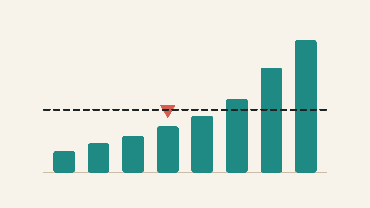
Mean vs median: which average should you use?
The mean shares the total equally. The median finds the middle case. In skewed data, those can tell very different stories.
Risk & Decisions
5 min · medium
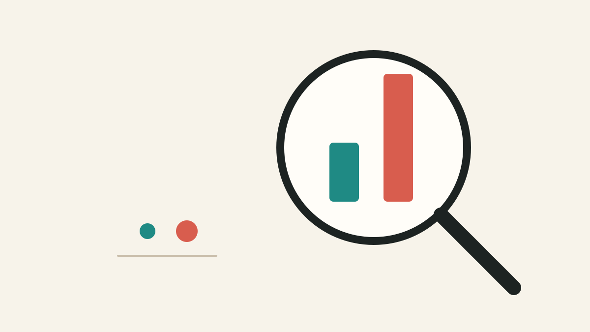
Relative risk vs absolute risk: the difference that changes decisions
Relative risk tells you how many times bigger a risk became. Absolute risk tells you how many extra people are affected.
Data Tricks
5 min · easy
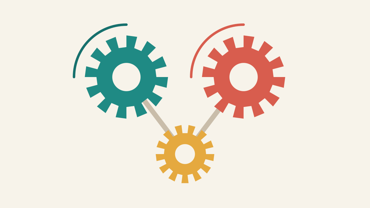
Correlation vs causation: why moving together is not proof
Correlation says two things move together. Causation says one changes the other. A hidden third factor can make correlation look causal.
Lessons
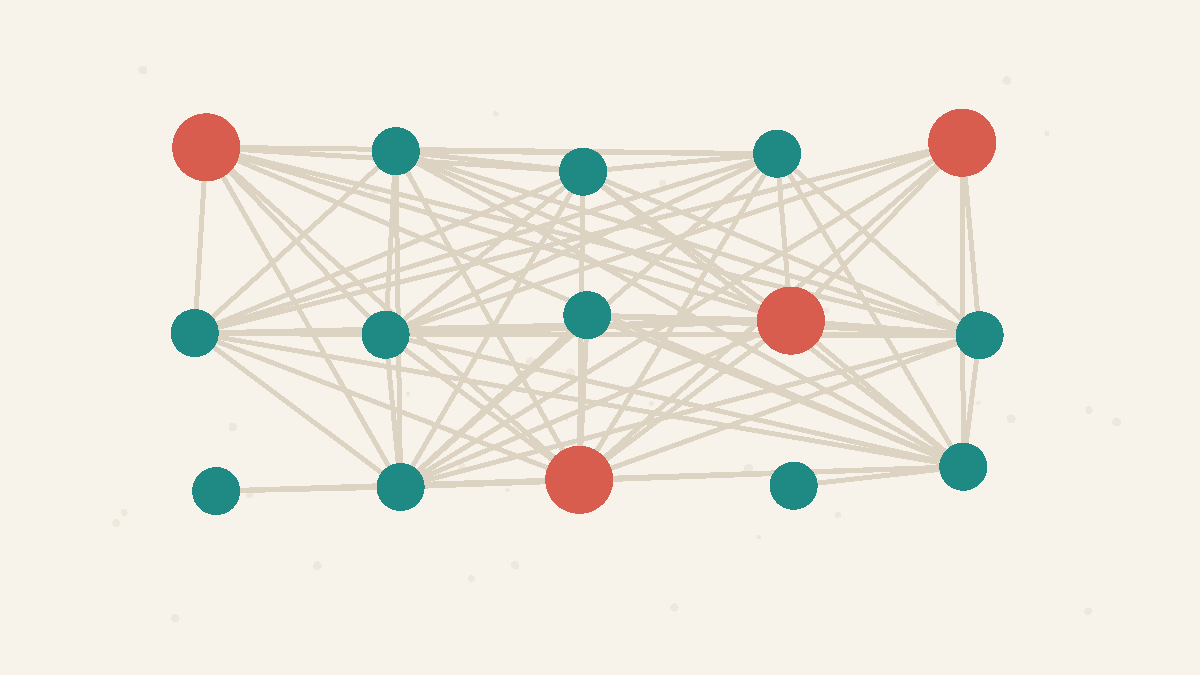
Collisions Grow Faster Than Intuition
The number of possible pairs grows roughly with the square of the group size.
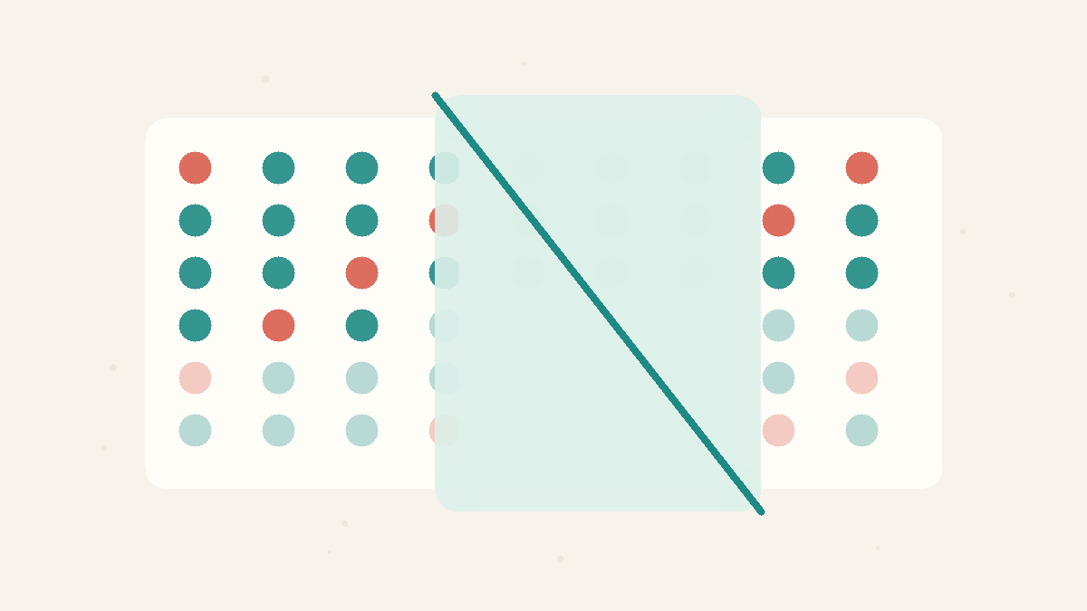
New Information Changes the Odds
Conditional probability is about updating the sample space after you learn something.
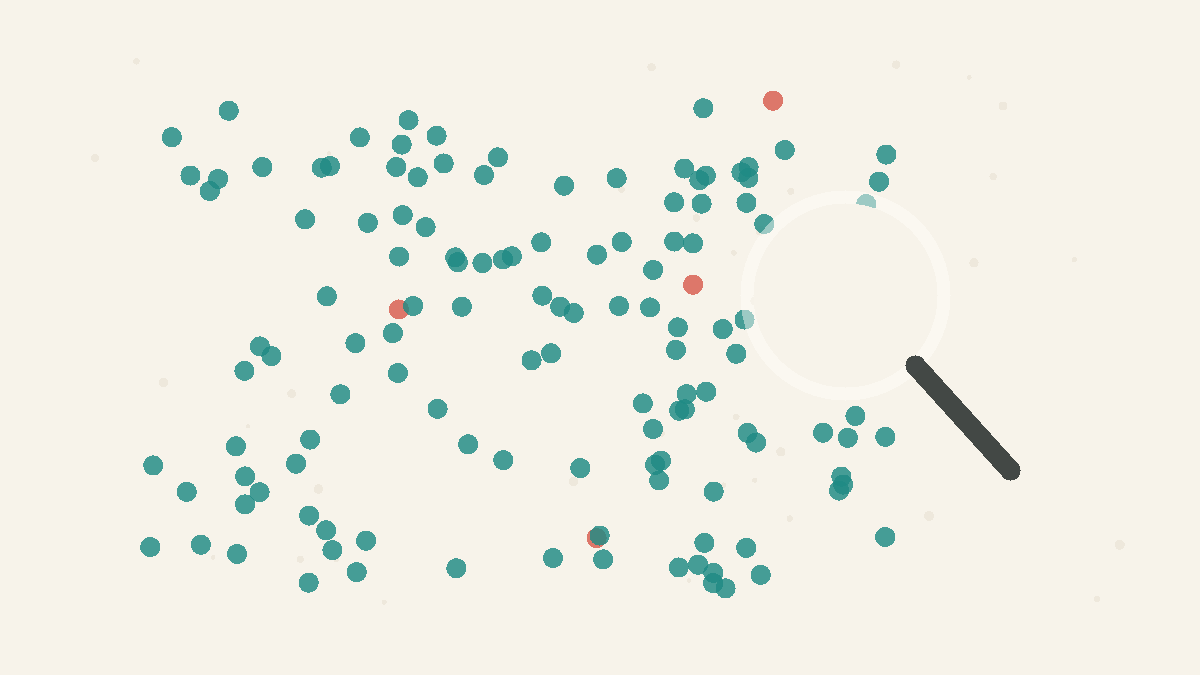
Rare Things Stay Rare
Even strong evidence can mislead when the thing you are testing for is very uncommon.
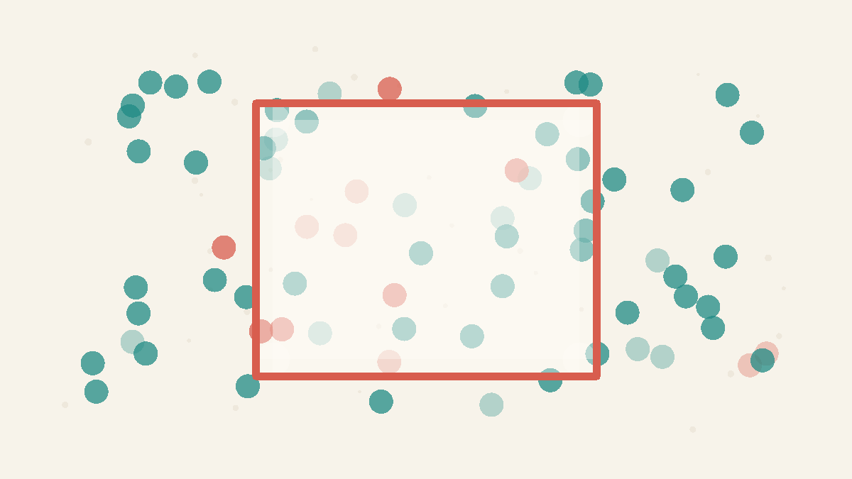
The Sample You See Matters
Your conclusion can be wrong when the data you see excludes important missing cases.

Framing Changes the Message
How a number is shown steers what people conclude from it.
Concepts
Conditional Probability
The probability of something after new information changes what is still possible. The important move is to update the denominator: cases ruled out by the new information should no longer be counted. Many mistakes happen when people keep using the original odds after the situation has narrowed.
Base Rates
The background frequency of something before you consider new evidence. A strong signal can still produce many false alarms when the thing being tested for is rare, because there are many more non-cases than cases. Good reasoning combines the new signal with the base rate.
Sampling Bias
A distorted result caused by looking at data that does not represent the population you care about. More data does not fix the problem if the same kinds of cases are still missing. Before trusting a conclusion, ask who had a chance to appear in the sample and who was left out.
Framing Effects
The same true numbers can give very different impressions depending on how they are presented: axis ranges, baselines, absolute versus relative, or wording. Framing changes perception without changing the facts, so check how a number is shown, not just what it is.
Expected Value
The long-run average outcome: each result weighted by how likely it is. It tells you whether a bet is favourable on average, but it ignores how badly a single rare outcome would hurt — which is why people rationally pay to avoid losses they could not absorb.
Averages Mislead
The mean adds everything up and divides, so a few extreme values can drag it far from the typical case. In skewed data the median — the middle value — better represents what is normal. Ask about the shape of the data, not just its average.
Absolute vs Relative Risk
A relative change ('50% more', 'doubles your risk') hides how big the underlying risk actually is. A large relative increase on a tiny base rate is still tiny. Always ask for the absolute numbers — how many in 100 before and after — not just the percentage change.
Correlation vs Causation
Two things moving together does not mean one causes the other. A third variable (a confounder) can drive both, or the link can be coincidence. Establishing causation needs more than correlation — usually a controlled comparison.