Collection
Data Tricks and Misleading Statistics
Examples of charts, averages, correlations, p-values, and samples that can mislead without obvious falsehoods.
Bad data interpretation rarely announces itself. A chart can crop the axis, an average can hide the distribution, a correlation can come from a shared cause, and a p-value can be treated like proof even when it is only one clue.
This collection is practical data literacy: how to inspect a claim, ask for the denominator, check the sample, and look for the picture hidden behind the summary number. It is built for the moments when a chart or headline feels precise but you need to know whether the precision is earned.
Use the pages together. A misleading chart, a weak p-value interpretation, and a biased sample are different failure modes, but they often appear in the same article, report, dashboard, or pitch.
A quick checklist for any claim
Ask: compared with what, measured how, and selected from whom? Then ask whether the number is a count, a rate, an average, a model estimate, or a statistical test result. Most misleading statistics become easier to spot once the denominator, sample, and uncertainty are visible.
Charts and summaries need each other
Truncated axes show how a chart can exaggerate. Anscombe's quartet shows the opposite problem: a table can hide the shape that a chart reveals. The safest habit is to use both. Let the graph show structure, then let the summary quantify what the graph suggests.
Evidence is not the same as certainty
P-values, confidence intervals, publication bias, and small samples all point to the same rule: evidence has strength, direction, and uncertainty. A result can be interesting without being settled. A responsible reader asks how noisy the estimate is and what evidence would be missing if the claim were weaker than it looks.
Featured Facts
Data Tricks
4 min · easy
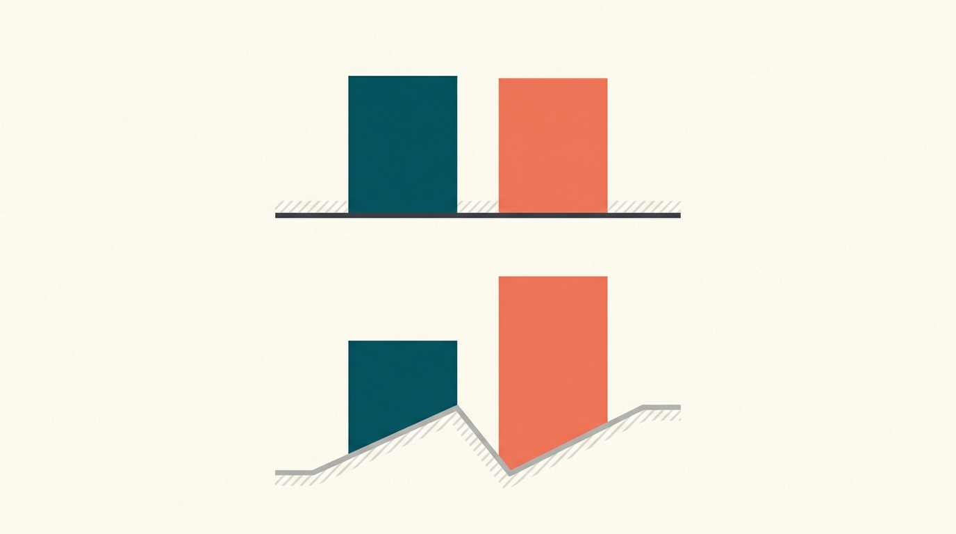
A chart can mislead without a single false number
Start a bar chart's axis at 95 instead of 0 and a two-point change can look like a landslide.
Data Tricks
4 min · easy
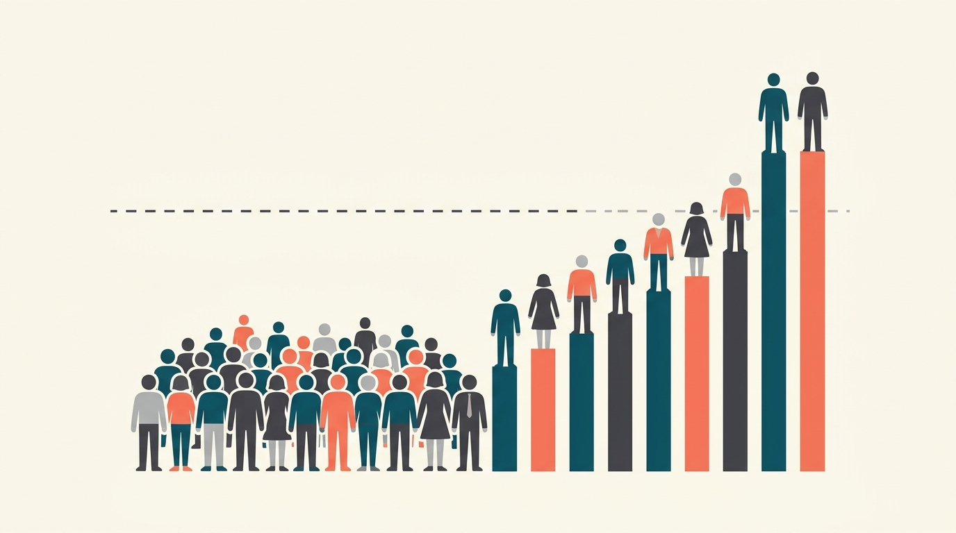
Most people earn less than the average wage
In a lopsided economy, a handful of huge incomes pull the 'average' above what a typical person actually makes.
Data Tricks
4 min · easy

Does ice cream cause drownings?
Imagine a seasonal chart where ice-cream sales and drownings rise together. Dessert looks suspicious, but the chart alone cannot show cause.
Data Tricks
4 min · medium
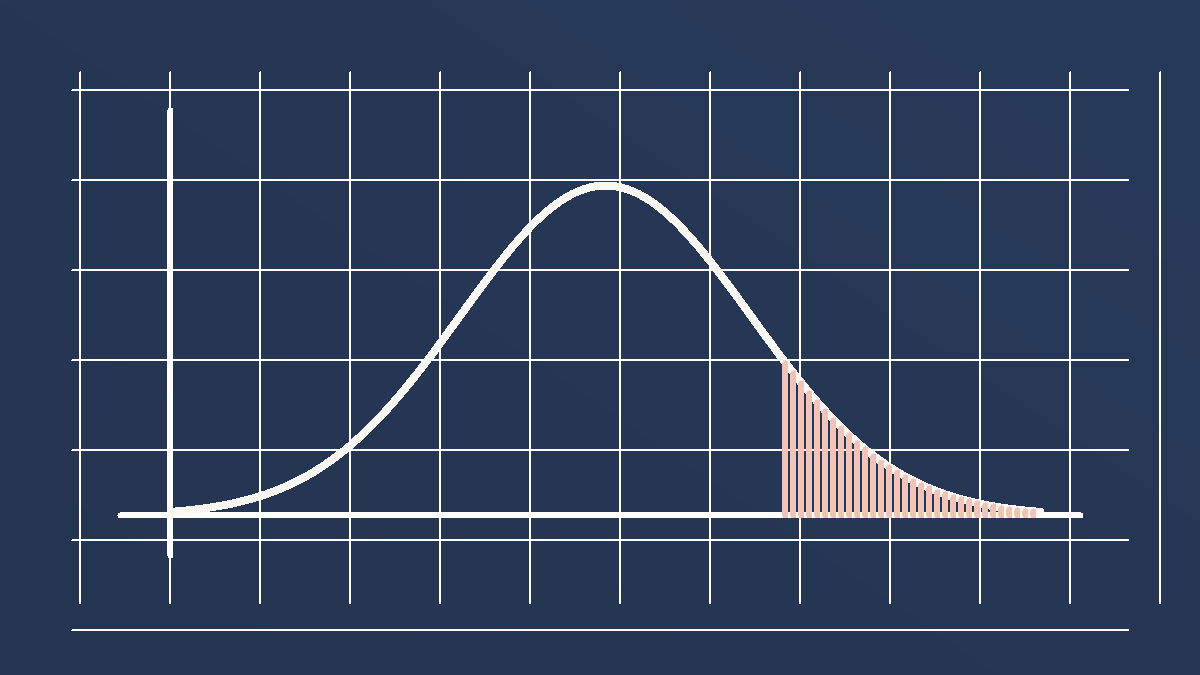
A p-value is not the chance your result is wrong
A p-value is a check for surprise: it asks how often a result this extreme would appear if there were really no effect. It does not tell you the chance your result is wrong.
Data Tricks
4 min · medium
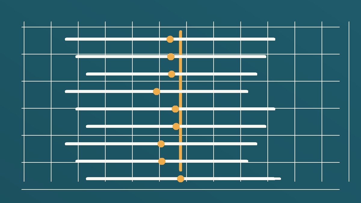
A 95% confidence interval is not a 95% promise
A 95% confidence interval means the method works 95% of the time in repeated samples, not that this exact range now has a 95% chance of holding the truth.
Data Tricks
4 min · easy
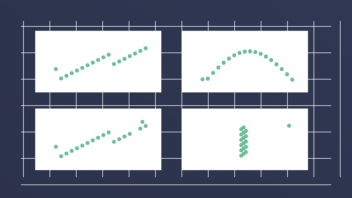
Anscombe's quartet has the same statistics and different stories
Four datasets can share almost the same mean, variance, correlation, and regression line, yet look completely different when plotted.
Data Tricks
4 min · medium

Publication bias hides the studies that found nothing
If only exciting results get published, the visible research record can make an effect look cleaner and stronger than it really is.
Data Tricks
4 min · easy

The missing planes mattered most
If you reinforce only the bullet holes on returning planes, you may protect the wrong places.
Data Tricks
5 min · easy
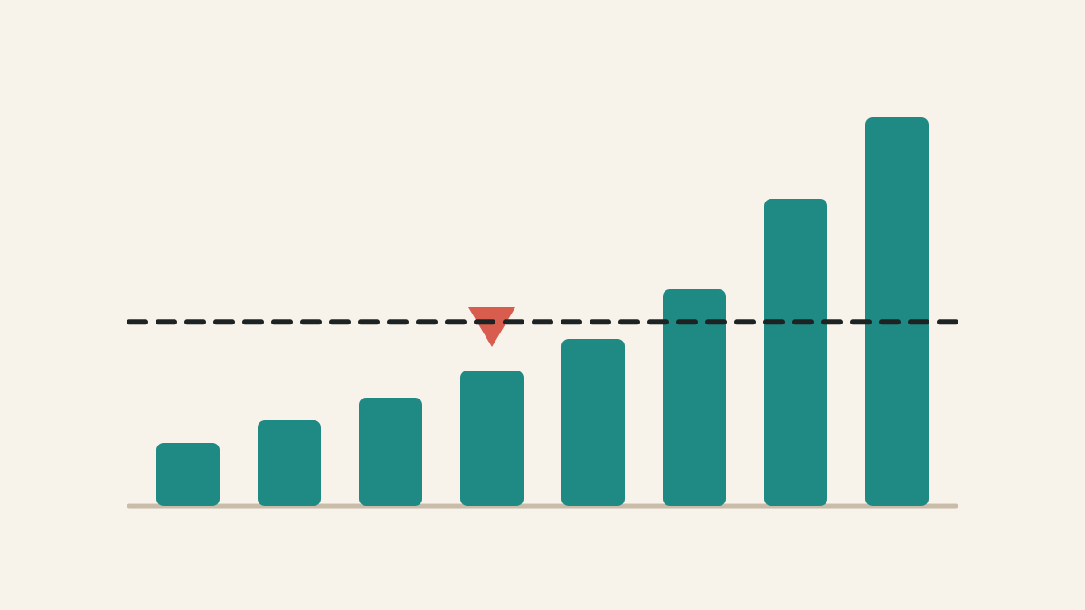
Mean vs median: which average should you use?
The mean shares the total equally. The median finds the middle case. In skewed data, those can tell very different stories.
Data Tricks
5 min · easy

Correlation vs causation: why moving together is not proof
Correlation says two things move together. Causation says one changes the other. A hidden third factor can make correlation look causal.
Data Tricks
5 min · medium

P-value vs confidence interval: what each one tells you
A p-value asks whether the data look surprising under a null model. A confidence interval asks which effect sizes remain plausible.
Data Tricks
5 min · easy
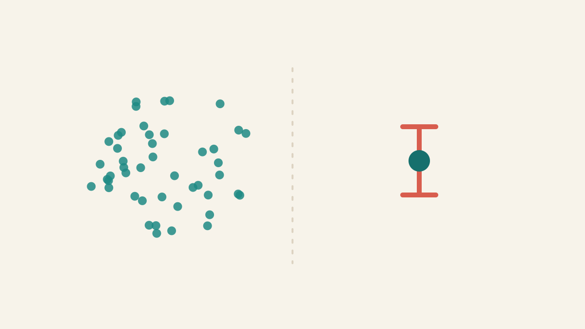
Standard error vs standard deviation: spread vs precision
Standard deviation describes spread among individual values. Standard error describes uncertainty in an estimate such as the mean.
Data Tricks
4 min · medium

The number 1 is suspiciously common
In many real-world datasets, numbers start with 1 far more often than with 9 — about 30.1% of the time.
Psychology of Numbers
4 min · easy
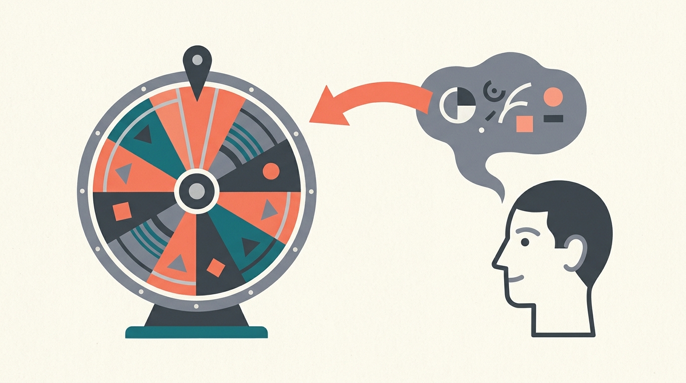
A random number can drag your guess
Spin a wheel to a random number, then ask people to estimate a fact — and those who saw a bigger number guess bigger, even when the number was obviously meaningless.
Lessons
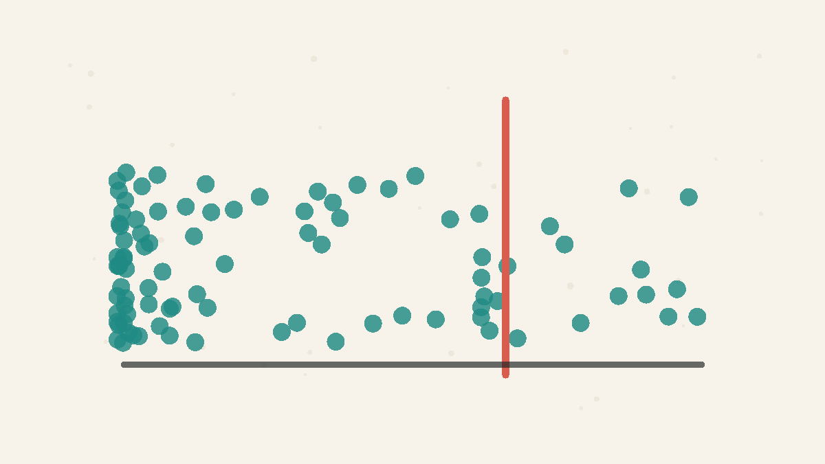
Averages Hide the Shape
A single number cannot capture a lopsided distribution.
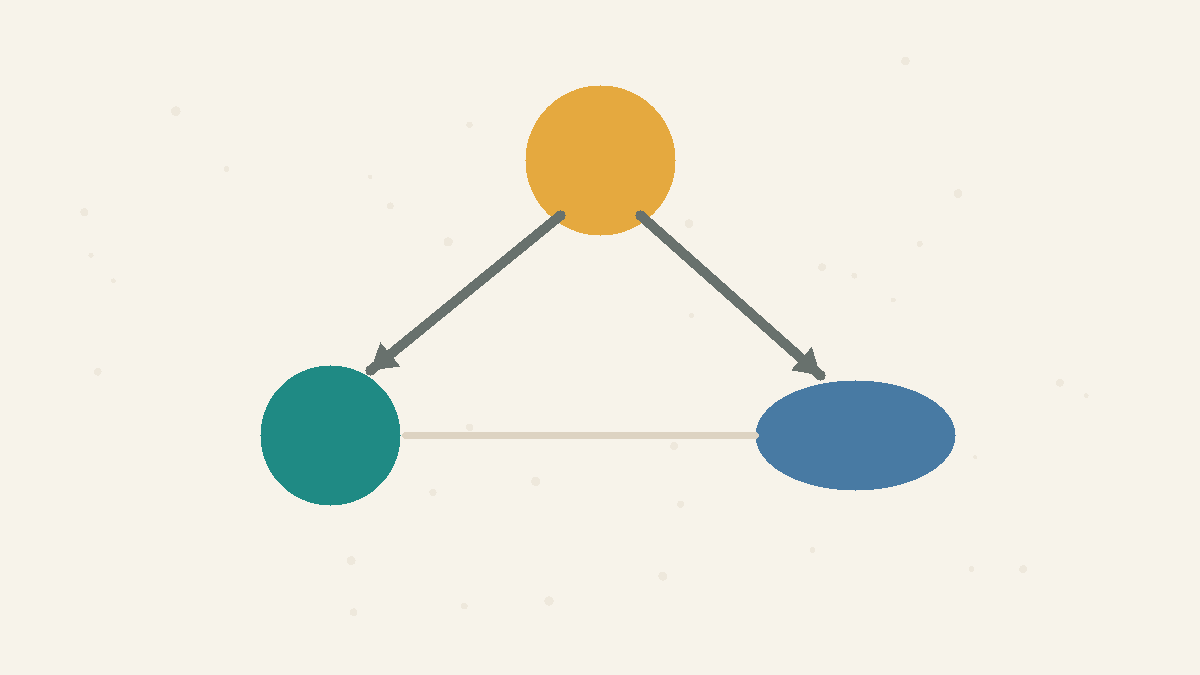
Shared Causes Fake Links
A hidden common cause can make unrelated things move together.

Framing Changes the Message
How a number is shown steers what people conclude from it.
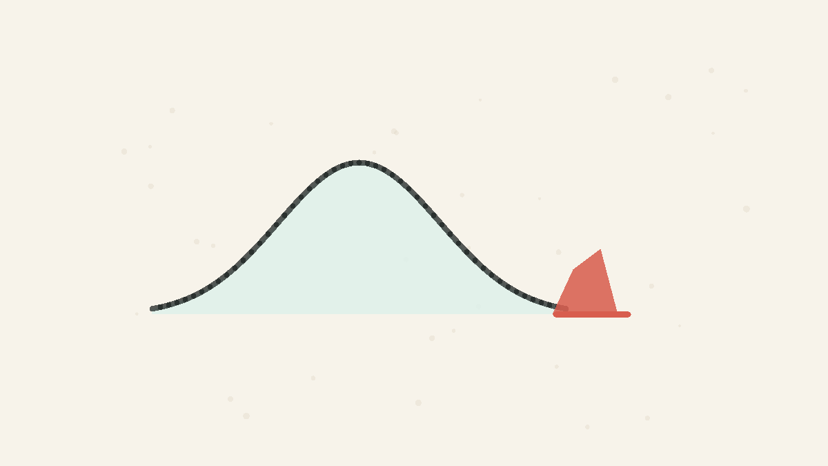
Small P Is Not Proof
A small p-value says the data would be surprising under a null model, not that the claim is probably true or important.
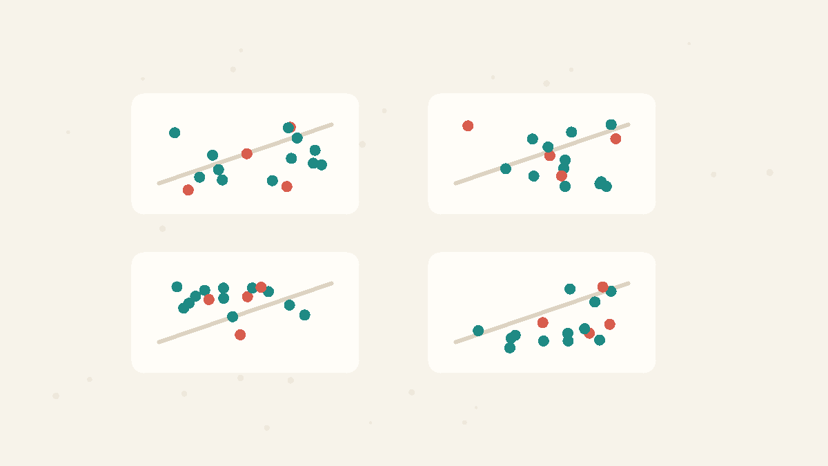
Summaries Need Pictures
Means, variances, correlations, and regression lines can match while the underlying data tell completely different stories.
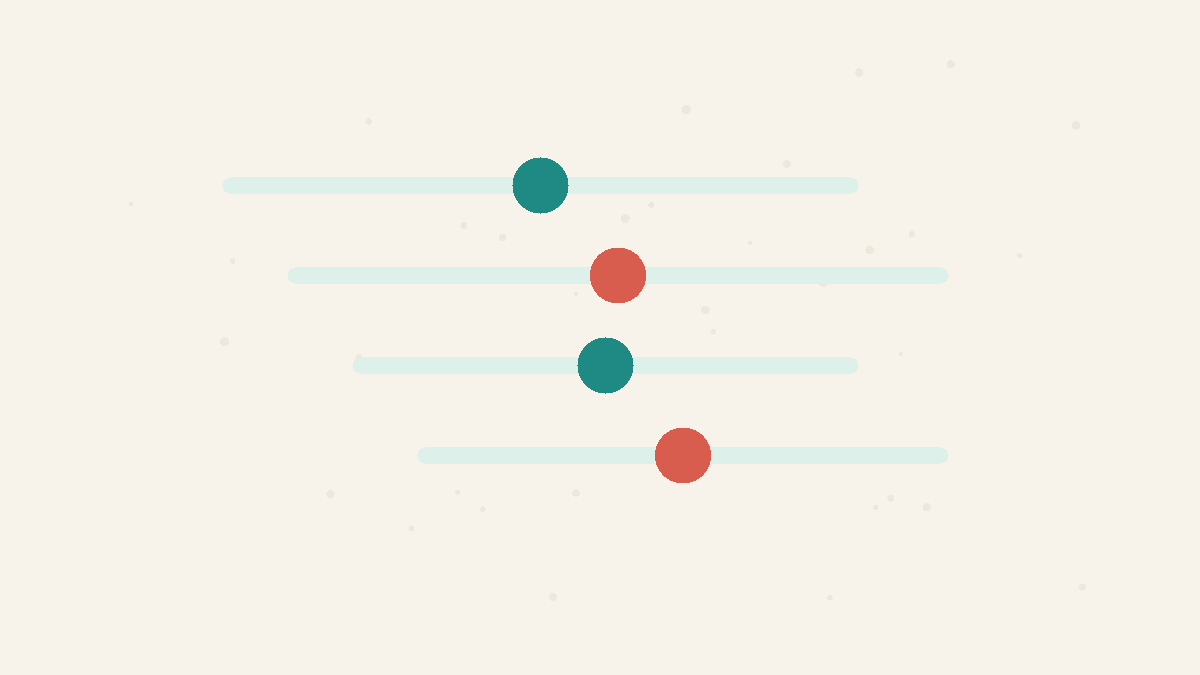
Uncertainty Needs Ranges
A measured number is usually a best estimate with sampling wobble around it, so honest comparisons need ranges as well as point estimates.
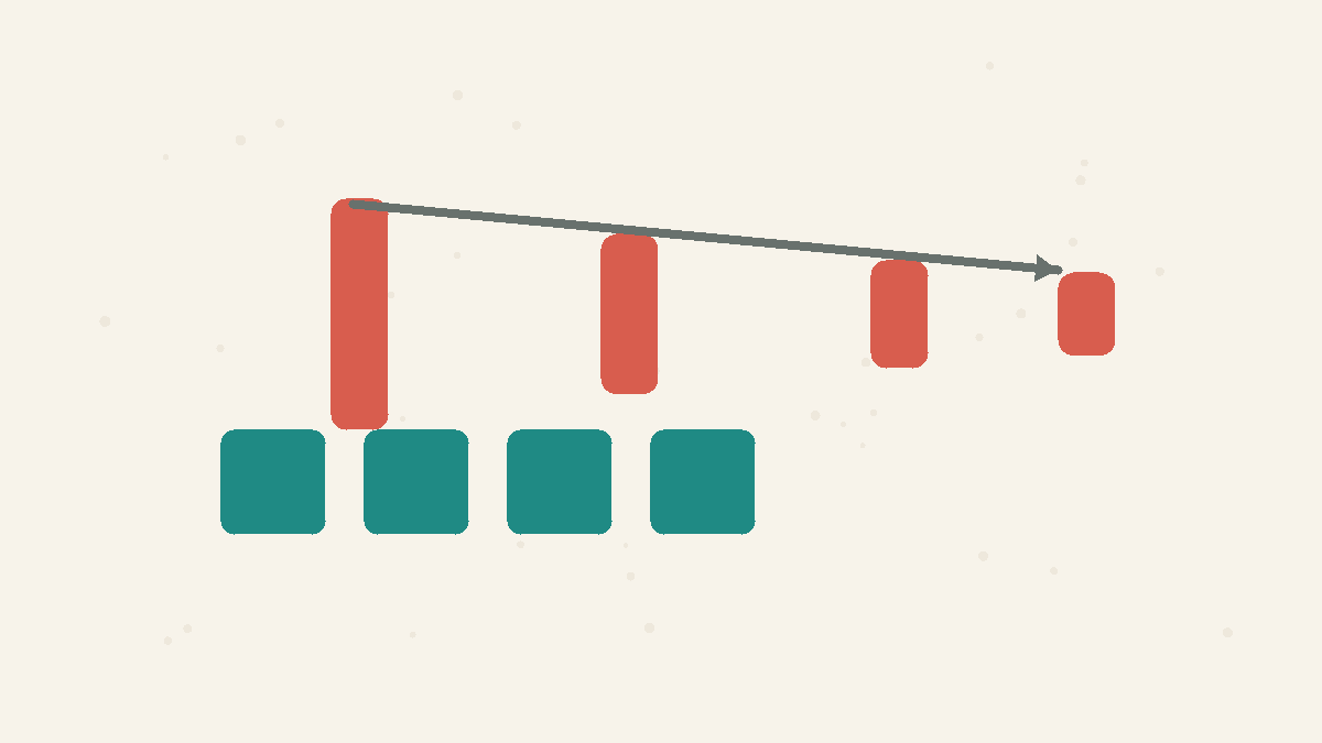
Precision Has Square-Root Returns
More data helps, but random error shrinks slowly: to halve the noise in an average, you usually need four times as many observations.
Concepts
Averages Mislead
The mean adds everything up and divides, so a few extreme values can drag it far from the typical case. In skewed data the median — the middle value — better represents what is normal. Ask about the shape of the data, not just its average.
Correlation vs Causation
Two things moving together does not mean one causes the other. A third variable (a confounder) can drive both, or the link can be coincidence. Establishing causation needs more than correlation — usually a controlled comparison.
P-Values
A p-value is the probability of seeing data at least this extreme if a specific null model were true. It is not the probability that the claim is false, not the chance the result was random, and not a measure of how large or important the effect is.
Summary Statistics
Summary statistics compress a dataset into numbers such as the mean, variance, correlation, or regression line. They are useful, but they can hide shape, outliers, clusters, and curved relationships that a graph would reveal immediately.
Publication Bias
Publication bias happens when studies with exciting or statistically significant results are more likely to be published, shared, or noticed than studies with null results. The visible literature can then exaggerate how strong an effect really is.
Confidence Intervals
A confidence interval is a range produced by a method that captures the true value a stated share of the time across repeated samples. It describes uncertainty in the estimating method, not a personal guarantee that one already-computed interval contains the truth.
Standard Error
Standard error is the typical sampling wobble of an estimate such as a mean. For independent observations, the standard error of a mean shrinks with the square root of the sample size, so cutting the error in half usually takes four times as much data.
Standard Deviation
Standard deviation describes how spread out individual observations are around their mean. It is about variation in the data itself. Standard error is different: it describes how much an estimate such as the sample mean would vary across repeated samples.